Introduction
Last week, we spoke about cluster analysis (week 4) to reveal noteworthy spatial patterns in the outcome data (health related events/measures) and ways to assess spatial autocorrelation. In week 3 (Spatial variation in risk), we also used spatial autocorrelation to interpolate the data (kriging) to produce smooth maps of our outcomes.
Starting next week and through the end of the class, we will talk about spatial regression modeling which combines regression modeling (first order trend) and spatial autocorrelation modeling (second order trend).
Today, in this transition session, we will cover some of the ways you can access and generate useful spatial data to incoporate into spatial regression analyses.
Accessing spatial data
Many spatial data have been made directly available within R thanks to bespoke packages, but for some data, you might need to look online or even generate these yourself.
From R packages
# Load packages
library(raster)
library(leaflet)
You have already used spatial data from the “raster” package via the getData function. Let’s take a deeper dive on these datasets.
# Read vignette for details and references
?raster::getData()
So you can download administrative boundaries (option name = 'GADM'), elevation (name = 'alt') and even climate variables (name = 'worldclim').
## Ethiopia
# Administrative boundaries (level 1)
ETH_Adm_1 <- raster::getData(name = "GADM",
                             country = "ETH",
                             level = 1)

leaflet() %>% # Plot
  addProviderTiles("CartoDB.Positron") %>%
  addPolygons(data = ETH_Adm_1,
              popup = ETH_Adm_1$NAME_1,
              label = ETH_Adm_1$NAME_1)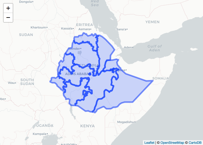
# Elevation (meters)
ETH_elev <- raster::getData(name = "alt",
                            country = "ETH")

raster_colorPal_elev <- colorNumeric(palette = topo.colors(64),
                                     domain = values(ETH_elev),
                                     na.color = NA) # Define palette
leaflet() %>% # Plot
  addProviderTiles("CartoDB.Positron") %>%
  addRasterImage(x = ETH_elev,
                 color = raster_colorPal_elev) %>%
  addLegend(title = "Elevation<br>(meters)",
            values = values(ETH_elev),
pal = raster_colorPal_elev) 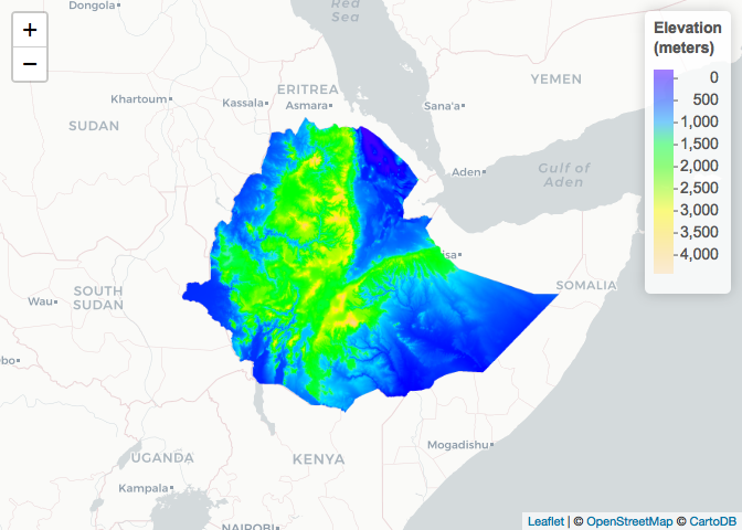
For the GADM and elevation datasets, you need to specify which country layer you want using the country ISO3 code. These are standard codes. If you are unsure, you can google it, or get a table using the following command:
raster::getData('ISO3')The level option gives you different administrative boundaries. Level 0 is country boundary, level 1 is province, level 2 district and for some countries you can get level 3 or 4. For elevation, disabling the mask option returns an elevation raster for the whole bounding box of the country as opposed to clipped to the country boundary:
## Ethiopia and South Sudan
# Administrative boundaries (level 0)
SSD_Adm_0 <- raster::getData(name = "GADM",
                             country = "SSD",
                             level = 0)

# Elevation (meters)
ETH_elev_unmasked <- raster::getData(name = "alt",
                                     country = "ETH",
                                     mask = FALSE)

raster_colorPal_elev_unmasked <- colorNumeric(palette = topo.colors(64),
                                              domain = values(ETH_elev_unmasked),
                                              na.color = NA) # Define palette
leaflet() %>% # Plot
  addProviderTiles("CartoDB.Positron") %>%
  addPolygons(data = SSD_Adm_0,
              popup = SSD_Adm_0$NAME_0,
              label = SSD_Adm_0$NAME_0,
              fillOpacity = 0,
              color = "red",
              weight = 3) %>%
  addRasterImage(x = ETH_elev_unmasked,
                 color = raster_colorPal_elev_unmasked) %>%
  addLegend(title = "Elevation<br>(meters)",
            values = values(ETH_elev_unmasked),
pal = raster_colorPal_elev_unmasked) 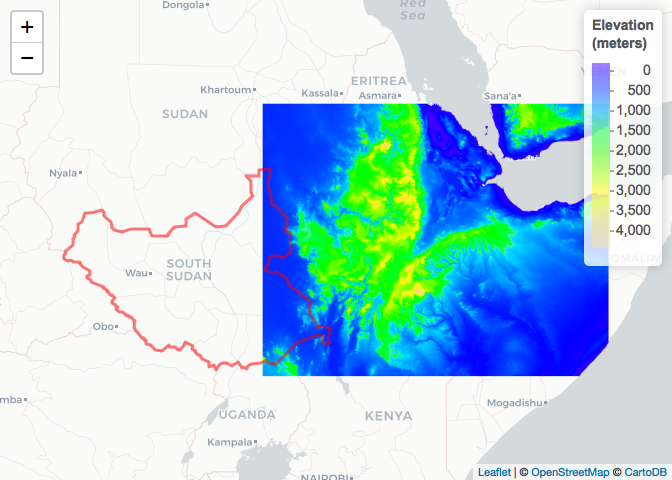
If you are requesting WorldClim data, you also need to specify the res parameter which controls the resolution of the data you would like in minutes (60 minutes in 1 degree). If you are requesting the 0.5 resolution version, these are only available as tiles and you therefore also have to specify lon and lat of a point which identifies the tile you would like - e.g. this would be a point in the country of interest which you can obtain using google earth, geojson.io or a similar tool.
# Precipitation from worldclim at the 2.5, 5 or 10 resolution (minutes of a degree)... no need for location specification?!?!
ETH_prec_10 <- raster::getData(name = "worldclim",
                            var = "prec",
                            res = 10)

# Precipitation from worldclim at the 0.5 resolution (minutes of a degree)... need to specifiy 'lon' and 'lat' of the tile looked for
ETH_prec_0.5 <- raster::getData(name = "worldclim",
                            var = "prec",
                            res = 0.5,
                            lon = 40,
                            lat = 10)
Let’s take a look at the two objects with different resolutions:
# Explore objects
ETH_prec_10
## class : RasterStack
## dimensions : 900, 2160, 1944000, 12 (nrow, ncol, ncell, nlayers)
## resolution : 0.1666667, 0.1666667 (x, y)
## extent : -180, 180, -60, 90 (xmin, xmax, ymin, ymax)
## crs : +proj=longlat +datum=WGS84 +ellps=WGS84 +towgs84=0,0,0
## names : prec1, prec2, prec3, prec4, prec5, prec6, prec7, prec8, prec9, prec10, prec11, prec12
## min values : 0, 0, 0, 0, 0, 0, 0, 0, 0, 0, 0, 0
## max values : 885, 736, 719, 820, 955, 1850, 2088, 1386, 904, 980, 893, 914
ETH_prec_0.5## class : RasterStack
## dimensions : 3600, 3600, 12960000, 12 (nrow, ncol, ncell, nlayers)
## resolution : 0.008333333, 0.008333333 (x, y)
## extent : 30, 60, 0, 30 (xmin, xmax, ymin, ymax)
## crs : +proj=longlat +datum=WGS84 +ellps=WGS84 +towgs84=0,0,0
## names : prec1_27, prec2_27, prec3_27, prec4_27, prec5_27, prec6_27, prec7_27, prec8_27, prec9_27, prec10_27, prec11_27, prec12_27
## min values : 0, 0, 0, 0, 0, 0, 0, 0, 0, 0, 0, 0
## max values : 126, 137, 240, 697, 289, 360, 458, 457, 340, 450, 584, 184
The WorldClim data are actually raster stacks, i.e. 12 rasterLayers stacked together in a single (cube) object referring to the long term average for each month. You can extract specific months (layers of the stack) using the [[]] command as per an R list.
# Restrict to October and plot
ETH_prec_10_Oct <- ETH_prec_10[[10]]
ETH_prec_0.5_Oct <- ETH_prec_0.5[[10]]


raster_colorPal_prec <- colorNumeric(palette = topo.colors(64),
                                     domain = values(ETH_prec_10_Oct),
                                     na.color = NA) # Define palette

leaflet() %>% # Plot
  addProviderTiles("CartoDB.Positron") %>%
  addRasterImage(x = ETH_prec_10_Oct,
                 color = raster_colorPal_prec,
                 group = "October precipitation (mm)") %>%
  addLegend(title = "October precipitation (mm)<br>(10' res)",
            values = values(ETH_prec_10_Oct),
            pal = raster_colorPal_prec)  %>%
  addLayersControl(overlayGroups = c("October precipitation (mm)"))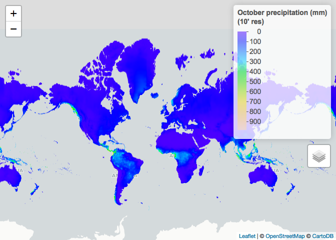
leaflet() %>% # Plot
  addProviderTiles("CartoDB.Positron") %>%
  addPolygons(data = SSD_Adm_0,
              popup = SSD_Adm_0$NAME_0,
              label = SSD_Adm_0$NAME_0,
              fillOpacity = 0,
              color = "red",
              weight = 3,
              group = "South Sudan") %>%
  addPolygons(data = ETH_Adm_1,
              popup = ETH_Adm_1$NAME_1,
              label = ETH_Adm_1$NAME_1,
              fillOpacity = 0,
              color = "black",
              weight = 3,
              group = "Ethiopia") %>%
  addRasterImage(x = ETH_prec_0.5_Oct,
                 color = raster_colorPal_prec,
                 group = "October precipitation (mm)") %>%
  addLegend(title = "October precipitation (mm)<br>(0.5' res)",
            values = values(ETH_prec_0.5_Oct),
            pal = raster_colorPal_prec) %>%
  addLayersControl(overlayGroups = c("October precipitation (mm)", "Ethiopia", "South Sudan")) %>%
  hideGroup("South Sudan")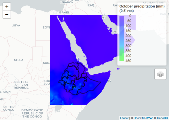
As you are dealing with tiles rather than country level datasets when using 0.5 resolution, in some situations you will need to obtain and merge more than 1 tile. For example, if we wanted to obtain the 0.5 resolution October precipitation for South Sudan, we would have to down load both required tiles and merge.
# Precipitation from worldclim at the 0.5 resolution (minutes of a degree)...
# This covers the left half of South Sudan (we already have the right half in the tile that covers Ethiopia)
SSD_prec_0.5_left <- raster::getData(name = "worldclim",
                                     var = "prec",
                                     res = 0.5,
                                     lon = 20,
                                     lat = 10)

# Restrict to October
SSD_prec_0.5_Oct_left <- SSD_prec_0.5_left[[10]]

# Merge left and right halves together
SSD_prec_0.5_Oct <- raster::merge(x = SSD_prec_0.5_Oct_left,
                                  y = ETH_prec_0.5_Oct)

# Crop to South Sudan extent
SSD_prec_0.5_Oct_Crop_Unmasked <- raster::crop(x = SSD_prec_0.5_Oct,
                                               y = SSD_Adm_0)

# Mask to South Sudan and plot
SSD_prec_0.5_Oct_Crop <- raster::mask(x = SSD_prec_0.5_Oct_Crop_Unmasked,
                                      mask = SSD_Adm_0)

raster_colorPal_prec_SSD <- colorNumeric(palette = topo.colors(64),
                                         domain = values(SSD_prec_0.5_Oct_Crop),
                                         na.color = NA) # Define palette

leaflet() %>% # Plot
  addProviderTiles("CartoDB.Positron") %>%
  addRasterImage(x = SSD_prec_0.5_Oct_Crop,
                 color = raster_colorPal_prec_SSD) %>%
  addPolygons(data = SSD_Adm_0,
              popup = SSD_Adm_0$NAME_0,
              label = SSD_Adm_0$NAME_0,
              fillOpacity = 0,
              color = "red",
              weight = 3) %>%
  addLegend(title = "October precipitation (mm)<br>(0.5' res)",
            values = values(SSD_prec_0.5_Oct_Crop),
            pal = raster_colorPal_prec_SSD)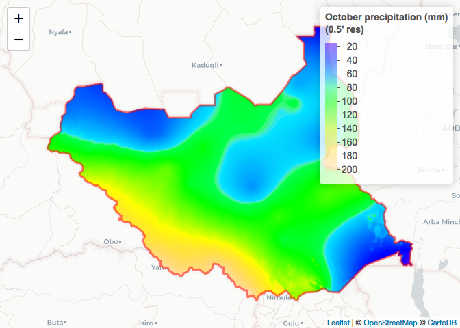
Other R packages
Here are a few R packages with spatial data available:
- raster
- getSpatialData
- rgistools
- rstoolbox
- sentinel2
- MODIS
Online
Often times those R packages simply provide easier access to data hosted online by various research groups and can have useful additional functions to process the data. Sometimes though, you just need access to the raw data and will need to download the data from an online source (which can come in many different formats) and import in R yourself.
Download the precipitation WorldClim variable at 10’ resolution available here. What you get is a folder with 12 .tif files, representing monthly precipitation (in mm and averaged over the 1970-2000 period), over the entire globe. As you encounter new file formats that you don’t know how to import in R, it’s good practice to scout forums. Let’s google How to import .tif files in R? and find our answer on that post. Fortunately, it looks like the raster function of the ‘raster’ package reads in .tif files.
# Path to wc2 folder you just downloaded
path_to_wc2_folder <- "...."

# List files in folder downloaded
list.files(path = paste0(path_to_wc2_folder, "/wc2"))
## [1] "readme.txt" "wc2.0_10m_prec_01.tif"
## [3] "wc2.0_10m_prec_02.tif" "wc2.0_10m_prec_03.tif"
## [5] "wc2.0_10m_prec_04.tif" "wc2.0_10m_prec_05.tif"
## [7] "wc2.0_10m_prec_06.tif" "wc2.0_10m_prec_07.tif"
## [9] "wc2.0_10m_prec_08.tif" "wc2.0_10m_prec_09.tif"
## [11] "wc2.0_10m_prec_10.tif" "wc2.0_10m_prec_11.tif"
## [13] "wc2.0_10m_prec_12.tif"
list.files(path = paste0(path_to_wc2_folder, "/wc2"), pattern = ".tif") # Restrict to .tif files## [1] "wc2.0_10m_prec_01.tif" "wc2.0_10m_prec_02.tif"
## [3] "wc2.0_10m_prec_03.tif" "wc2.0_10m_prec_04.tif"
## [5] "wc2.0_10m_prec_05.tif" "wc2.0_10m_prec_06.tif"
## [7] "wc2.0_10m_prec_07.tif" "wc2.0_10m_prec_08.tif"
## [9] "wc2.0_10m_prec_09.tif" "wc2.0_10m_prec_10.tif"
## [11] "wc2.0_10m_prec_11.tif" "wc2.0_10m_prec_12.tif"
# Read in October precipitation
wc2_prec_10_Oct <- raster::raster(x = paste0(path_to_wc2_folder, "/wc2/wc2.0_10m_prec_10.tif"))

# Compare to data downloaded via raster::getData()
wc2_prec_10_Oct
## class : RasterLayer
## dimensions : 1080, 2160, 2332800 (nrow, ncol, ncell)
## resolution : 0.1666667, 0.1666667 (x, y)
## extent : -180, 180, -90, 90 (xmin, xmax, ymin, ymax)
## crs : +proj=longlat +datum=WGS84 +no_defs +ellps=WGS84 +towgs84=0,0,0
## source : https://raw.githubusercontent.com/HughSt/HughSt.github.io/master/_posts/Week_5_Spatial_Epi_files/wc2/wc2.0_10m_prec_10.tif
## names : wc2.0_10m_prec_10
## values : 0, 2328 (min, max)
ETH_prec_10_Oct## class : RasterLayer
## dimensions : 900, 2160, 1944000 (nrow, ncol, ncell)
## resolution : 0.1666667, 0.1666667 (x, y)
## extent : -180, 180, -60, 90 (xmin, xmax, ymin, ymax)
## crs : +proj=longlat +datum=WGS84 +ellps=WGS84 +towgs84=0,0,0
## source : /Users/francoisrerolle/Desktop/wc10/prec10.bil
## names : prec10
## values : 0, 980 (min, max)
leaflet() %>% # Plot
  addProviderTiles("CartoDB.Positron") %>%
  addRasterImage(x = ETH_prec_10_Oct,
                 color = raster_colorPal_prec,
                 group = "raster::getData") %>%
  addRasterImage(x = wc2_prec_10_Oct,
                 color = raster_colorPal_prec,
                 group = "WorldClim.com download") %>%
  addLegend(title = "October precipitation (mm)<br>(10' res)",
            values = values(ETH_prec_10_Oct),
            pal = raster_colorPal_prec) %>%
  addLayersControl(overlayGroups = c("raster::getData", "WorldClim.com download")) %>%
  hideGroup("WorldClim.com download")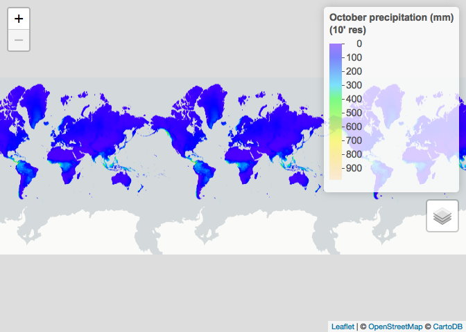
# Another more elegant way to read in the data downloaded online
wc2_prec_10 <- raster::stack(x = paste0(path_to_wc2_folder, "/wc2/", list.files(path = paste0(path_to_wc2_folder, "/wc2"), pattern = ".tif")))
wc2_prec_10
## class : RasterStack
## dimensions : 1080, 2160, 2332800, 12 (nrow, ncol, ncell, nlayers)
## resolution : 0.1666667, 0.1666667 (x, y)
## extent : -180, 180, -90, 90 (xmin, xmax, ymin, ymax)
## crs : +proj=longlat +datum=WGS84 +no_defs +ellps=WGS84 +towgs84=0,0,0
## names : wc2.0_10m_prec_01, wc2.0_10m_prec_02, wc2.0_10m_prec_03, wc2.0_10m_prec_04, wc2.0_10m_prec_05, wc2.0_10m_prec_06, wc2.0_10m_prec_07, wc2.0_10m_prec_08, wc2.0_10m_prec_09, wc2.0_10m_prec_10, wc2.0_10m_prec_11, wc2.0_10m_prec_12
## min values : 0, 0, 0, 0, 0, 0, 0, 0, 0, 0, 0, 0
## max values : 908, 793, 720, 1004, 2068, 2210, 2381, 1674, 1955, 2328, 718, 806
wc2_prec_10[[10]]## class : RasterLayer
## dimensions : 1080, 2160, 2332800 (nrow, ncol, ncell)
## resolution : 0.1666667, 0.1666667 (x, y)
## extent : -180, 180, -90, 90 (xmin, xmax, ymin, ymax)
## crs : +proj=longlat +datum=WGS84 +no_defs +ellps=WGS84 +towgs84=0,0,0
## source : https://raw.githubusercontent.com/HughSt/HughSt.github.io/master/_posts/Week_5_Spatial_Epi_files/wc2/wc2.0_10m_prec_10.tif
## names : wc2.0_10m_prec_10
## values : 0, 2328 (min, max)
Other online resources
Here are a few good websites with free downloadable spatial data
Spatial data: where do they come from?
We often interact with climatic and environmental raster data, like the land use dataset shown below. But how are these datasets produced? The answer is via remotely sensed imagery, such as images taken by satellites, planes or drones. These data can sometimes be combined with ground data, such as data from weather stations.
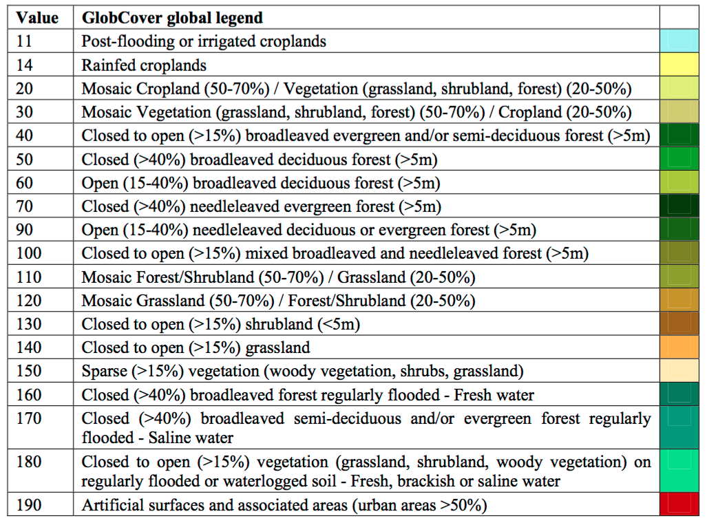
# Land use (# For information on land use classifications see http://due.esrin.esa.int/files/GLOBCOVER2009_Validation_Report_2.2.pdf)
ETH_land_use <- raster::raster("https://github.com/HughSt/HughSt.github.io/blob/master/course_materials/week2/Lab_files/ETH_land_use.tif?raw=true")
plot(ETH_land_use)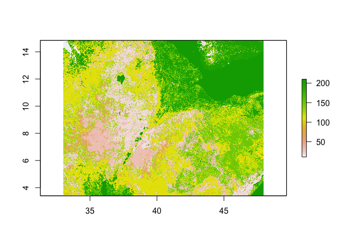
Remote sensing data
Satellites orbiting around the globe carry instruments to take measurements. Just likes our eyes or cameras, the sensors onboard satellites receive a radiation that was emitted by a source of light (sun, flash, light bulb, etc…) and reflected by an object. The differences between the pre and post reflection radiations characterize properties of the reflecting object such as color for which our eyes have been optimized to perceive. You can picture the radiation as a wave signal. Speed radars and the SRTM mission act in the same way (except they also send the incident radiation) and from the difference in the 2 wave signals calculate speed and elevation respectively.
Speed, elevation, color are calculated based on the wavelengths property of the wave. Sensors onboard remote sensing satelitte mission can receive multiple waves across the spectrum.
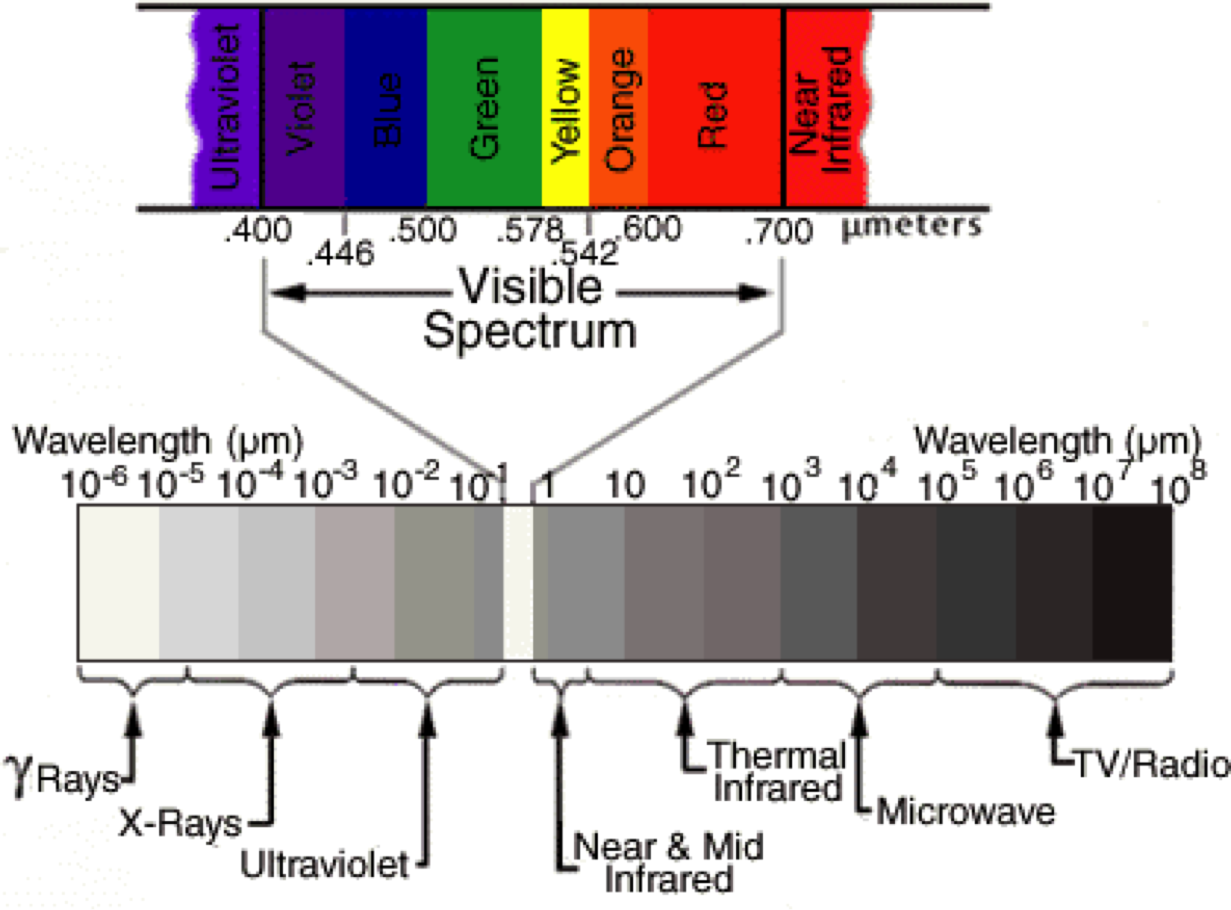
For instance the satellite Landsat-8 has 11 bands (i.e wavelengths ranges) at which it measures the reflectance (fraction of incident electromagnetic power that is reflected) which we can simply see as a measure of ‘light’ intensity reflected by the earth surface.
# Load some Etiophia Landsat data for the year 2017 (only 7 first bands available)
Landsat_Band_1 <- raster::raster(x = "https://raw.githubusercontent.com/HughSt/HughSt.github.io/master/course_materials/week5/Lab_files/Landsat/Landsat_2017_Band1.tif")
Landsat_Band_2 <- raster::raster(x = "https://raw.githubusercontent.com/HughSt/HughSt.github.io/master/course_materials/week5/Lab_files/Landsat/Landsat_2017_Band2.tif")
Landsat_Band_3 <- raster::raster(x = "https://raw.githubusercontent.com/HughSt/HughSt.github.io/master/course_materials/week5/Lab_files/Landsat/Landsat_2017_Band3.tif")
Landsat_Band_4 <- raster::raster(x = "https://raw.githubusercontent.com/HughSt/HughSt.github.io/master/course_materials/week5/Lab_files/Landsat/Landsat_2017_Band4.tif")
Landsat_Band_5 <- raster::raster(x = "https://raw.githubusercontent.com/HughSt/HughSt.github.io/master/course_materials/week5/Lab_files/Landsat/Landsat_2017_Band5.tif")
Landsat_Band_6 <- raster::raster(x = "https://raw.githubusercontent.com/HughSt/HughSt.github.io/master/course_materials/week5/Lab_files/Landsat/Landsat_2017_Band6.tif")
Landsat_Band_7 <- raster::raster(x = "https://raw.githubusercontent.com/HughSt/HughSt.github.io/master/course_materials/week5/Lab_files/Landsat/Landsat_2017_Band7.tif")

# Stack together layers
Landsat_Band <- raster::stack(Landsat_Band_1,
                              Landsat_Band_2,
                              Landsat_Band_3,
                              Landsat_Band_4,
                              Landsat_Band_5,
                              Landsat_Band_6,
                              Landsat_Band_7)

# Explore the reflectance values. Assume you should normalize by 10000 to get reflectance
summary(Landsat_Band[[1]])
## Landsat_2017_Band1
## Min. 11.0
## 1st Qu. 338.5
## Median 404.0
## 3rd Qu. 494.5
## Max. 2538.5
## NA's 0.0
How do you get from reflectance to land use surfaces?
First you can read some documentation about the wavelength ranges covered by band for your satellite.
# Label bands accordingly
names(Landsat_Band) <- c('Ultra.blue', 'Blue', 'Green', 'Red', 'NIR', 'SWIR1', 'SWIR2')

# Plot individual layers
par(mfrow = c(2,2))
plot(Landsat_Band_2, main = "Blue", col = gray(0:100 / 100))
plot(Landsat_Band_3, main = "Green", col = gray(0:100 / 100))
plot(Landsat_Band_4, main = "Red", col = gray(0:100 / 100))
plot(Landsat_Band_5, main = "NIR", col = gray(0:100 / 100))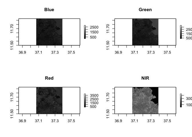
Pop quiz: what do you think is in the top right corner of our spatial extent?
Notice the difference in shading and range of legends between the different bands. This is because different surface features reflect the incident solar radiation differently. Each layer represent how much incident solar radiation is reflected for a particular wavelength range. For example, vegetation reflects more energy in NIR than other wavelengths and thus appears brighter. In contrast, water absorbs most of the energy in the NIR wavelength and it appears dark.
We do not gain that much information from these grey-scale plots; they are often combined into a “composite” to create more interesting plots. To make a “true (or natural) color” image, that is, something that looks like a normal photograph (vegetation in green, water blue etc), we need bands in the red, green and blue regions. For this Landsat image, band 4 (red), 3 (green), and 2 (blue) can be used. The plotRGB method can be used to combine them into a single composite. You can also supply additional arguments to plotRGB to improve the visualization (e.g. a linear stretch of the values, using stretch = “lin”).
raster::plotRGB(x = Landsat_Band,
                r = 4,
                g = 3,
                b = 2,
                stretch = "lin",
                main = "Landsat True Color Composite")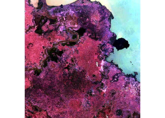
The true-color composite reveals much more about the landscape than the earlier gray images. Another popular image visualization method in remote sensing is known “false color” image in which NIR, red, and green bands are combined. This representation is popular as it makes it easy to see the vegetation (in red).
raster::plotRGB(x = Landsat_Band,
                r = 5,
                g = 4,
                b = 3,
                stretch = "lin",
                main = "Landsat False Color Composite")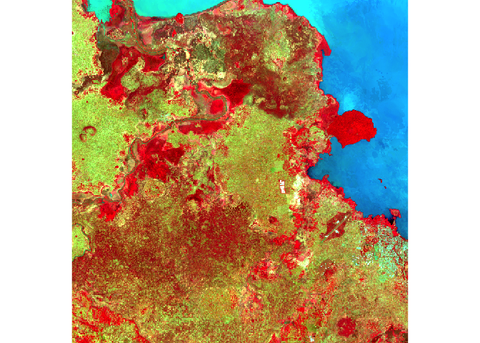
Relation between bands
A scatterplot matrix can be helpful in exploring relationships between raster layers. This can be done with the pairs() function of the “raster” package.
Plot of reflection in the ultra-blue wavelength against reflection in the blue wavelength.
raster::pairs(x = Landsat_Band[[1:2]], main = "Ultra-blue versus Blue")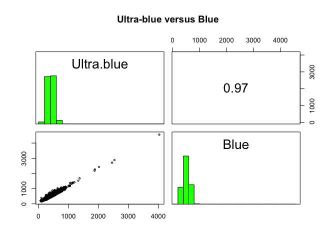
Plot of reflection in the red wavelength against reflection in the NIR wavelength.
raster::pairs(x = Landsat_Band[[4:5]], main = "Red versus NIR")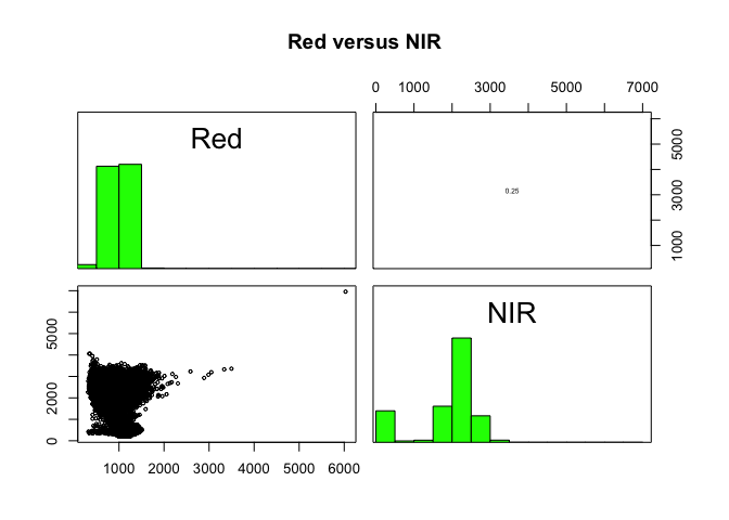
The first plot reveals high correlations between the blue wavelength regions. Because of the high correlation, we can just use one of the blue bands without losing much information. The distribution of points in second plot (between NIR and red) is unique due to its triangular shape. Vegetation reflects more in the NIR range than in the red and creates the upper corner close to NIR (y) axis. Water absorbs energy from all the bands and occupies the location close to origin. The furthest corner is created due to highly reflecting surface features like bright soil or concrete.
Spectral profiles
A plot of the spectrum (all bands) for pixels representing a certain earth surface features (e.g. water) is known as a spectral profile. Such profiles demonstrate the differences in spectral properties of various earth surface features and constitute the basis for image analysis.
Let’s start by loading some training data from the region which compiles GPS coordinates of points for which we know the Land use and Land cover (LULC) class.
# Load the training dataset, which compiles GPS coordinates of points for which we know the Land use and Land cover (LULC) class
Training_Data <- read.csv(file = "https://raw.githubusercontent.com/HughSt/HughSt.github.io/master/course_materials/week5/Lab_files/LULC_Training_Tana.csv", header = T)

# Explore the data
head(Training_Data)
## Latitude Longitude LULC
## 1 11.75859 37.26399 12
## 2 11.70965 37.14431 12
## 3 11.79550 37.38545 17
## 4 11.78845 37.15329 10
## 5 11.50553 37.15888 10
## 6 11.79360 37.29655 10
# Label LULC classes
Training_Data$LULC <- factor(Training_Data$LULC,
                             levels = c(9, 10, 11, 12, 13, 17),
                             labels = c("Savanna", "Grassland", "Wetland", "Cropland", "Urban", "Water"))

# Frequency table of classes
table(Training_Data$LULC)
##
## Savanna Grassland Wetland Cropland Urban Water
## 4 481 27 328 4 156
You can now convert the data frame to a spatial object to extract reflectance values at training points. Spectral values can be extracted from any multispectral data set using extract() function of the “raster” package.
# Convert data frame to a SpatialPointsDataFrame by specifying coordinates
Training_Data_DF <- Training_Data # Save a data frame version
sp::coordinates(Training_Data) <- c("Longitude", "Latitude")

# Extract values from the reflectance images at the point locations and merge to training dataset
Training_Data_Reflectance <- cbind(data.frame(LULC =Training_Data_DF$LULC), as.data.frame(raster::extract(x = Landsat_Band, y = Training_Data)))
head(Training_Data_Reflectance)
## LULC Ultra.blue Blue Green Red NIR SWIR1 SWIR2
## 1 Cropland 372 512 823 991 2494 2548 1620
## 2 Cropland 375 483 795 1183 2038 1886 1613
## 3 Water 603 780 1378 1111 259 171 141
## 4 Grassland 364 485 806 917 1767 1524 997
## 5 Grassland 355 437 693 765 1972 1990 1427
## 6 Grassland 407 499 759 868 2254 2161 1433
We can now compute the mean reflectance values for each class and each band and plot to obtain the spectral profiles.
# Average reflectance values over LULC classes
LULC_Mean_Reflectance <- stats::aggregate(formula = . ~ LULC, data = Training_Data_Reflectance, FUN = function(x){round(mean(x), digits = 2)})
LULC_Mean_Reflectance
## LULC Ultra.blue Blue Green Red NIR SWIR1 SWIR2
## 1 Savanna 404.00 455.25 702.12 747.62 2303.88 1639.50 1085.62
## 2 Grassland 367.07 450.39 731.63 883.92 2137.84 2044.79 1478.32
## 3 Wetland 360.65 440.81 760.96 664.87 1929.70 1099.56 586.33
## 4 Cropland 408.25 503.26 794.93 1030.95 2308.46 2169.48 1615.76
## 5 Urban 476.38 580.12 848.00 957.88 2128.75 1884.00 1393.12
## 6 Water 571.12 731.72 1313.05 1131.43 302.03 170.37 136.47
# Reshape to long format
library(tidyr)
LULC_Mean_Reflectance_Long <- tidyr::gather(data = LULC_Mean_Reflectance,
                                            key = "Band",
                                            value = "Reflectance",
                                            ... = - "LULC",
                                            factor_key = T)

# Plot
library(ggplot2)
ggplot2::ggplot(data = LULC_Mean_Reflectance_Long, mapping = aes(x = Band, y = Reflectance, color = LULC, group = LULC)) + geom_line()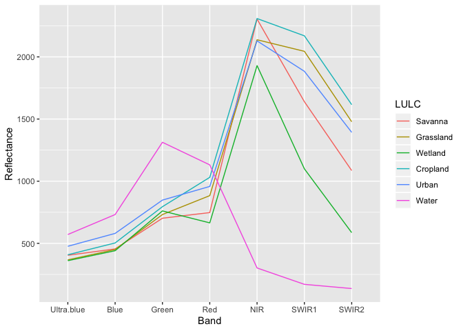
The spectral profiles show (dis)similarity in the reflectance of different features on the earth’s surface (or above it). ‘Water’ shows relatively low reflection in all wavelengths, while all other classes have relatively high reflectance in the longer wavelengts. Remember though that while our training data is made up of 1000 points across 6 LULC classes, we have relatively few observations for ‘Savanna’, ‘Wetland’ and ‘Urban’ classes.
Classification
So now we have observed classes and the spectral values for each of those observations, it is possible to build a classification model. There are a number of different ways of fitting such a classifcation (sometimes called multi-nomial) model. Here we are going to use a random forest model which is a type of decision tree machine learning model. We are going to use the “randomForest” package.
library(randomForest)
RF_Model <- randomForest::randomForest(x = Training_Data_Reflectance[,2:8], y = Training_Data_Reflectance[,1])
RF_Model
##
## Call:
## randomForest(x = Training_Data_Reflectance[, 2:8], y = Training_Data_Reflectance[, 1])
## Type of random forest: classification
## Number of trees: 500
## No. of variables tried at each split: 2
##
## OOB estimate of error rate: 22.9%
## Confusion matrix:
## Savanna Grassland Wetland Cropland Urban Water class.error
## Savanna 0 1 2 1 0 0 1.00000000
## Grassland 1 378 8 92 0 2 0.21413721
## Wetland 1 10 12 0 0 4 0.55555556
## Cropland 0 99 1 228 0 0 0.30487805
## Urban 0 2 0 2 0 0 1.00000000
## Water 0 1 2 0 0 153 0.01923077
By inspecting the output of the model, we realize it is not doing a super job. The OOB estimate of error rate refers to ‘out of bag’ error rate. In this context, out of bag is similar to cross-vadliation we explored as part of interpolation - i.e. how well the model is predicting data not included in the model. Again remember we only have a few observations in our training dataset. Classification of the ‘water’ class is pretty good, thanks to its particular spectral profile. Now that we have a model of the relationship between land cover and reflectance values, we can predict land cover over our entire region.
LULC_predicted <- raster::predict(object = Landsat_Band,
                                  model = RF_Model,
                                  progress = 'text',
                                  type = 'response',
                                  overwrite = TRUE)
##
|
| | 0%
|
|================ | 25%
|
|================================ | 50%
|
|================================================= | 75%
|
|=================================================================| 100%
##
library(RColorBrewer)
factpal_LULC <- colorFactor(palette = brewer.pal(n = length(levels(Training_Data_DF$LULC)), name = "Set1"),
                            domain = c(1:length(levels(Training_Data_DF$LULC)))) # define color palette

leaflet() %>% # Plot
  addProviderTiles("Esri.WorldImagery") %>%
  addRasterImage(x = LULC_predicted,
                 color = factpal_LULC,
                 group = "Predicted LULC") %>%
  addLegend(title = "Predicted LULC",
            colors = brewer.pal(n = length(levels(Training_Data_DF$LULC)), name = "Set1"),
            labels = c("Savanna", "Grassland", "Wetland", "Cropland", "Urban", "Water"),
            opacity = 1) %>%
  addLayersControl(overlayGroups = c("Predicted LULC"))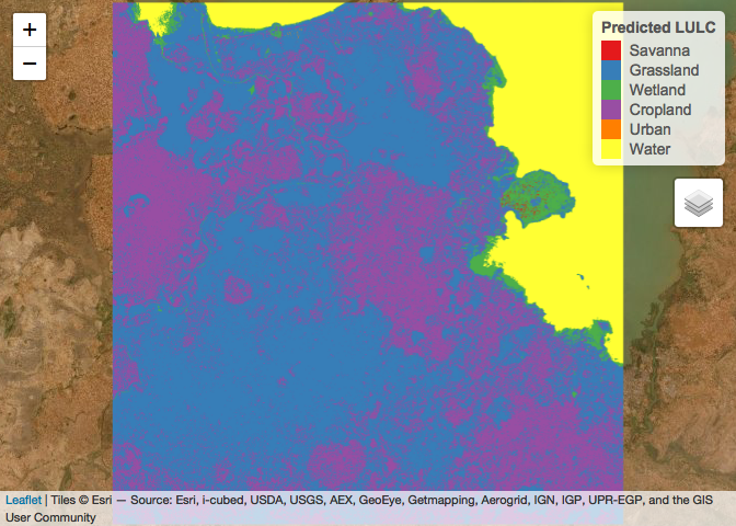
Concluding remarks
Now you have a sense of how remote sensing can be used to produce all sort of environmental layers. The quality of those will depend on the spatial and temporal resolutions of the sensors as well as the techniques used to process the raw data (clouds?) and model it to produce more useful layers.
Resources
This week borrows heavily from this excellent tutorial
Readings
Hay SI. An overview of remote sensing and geodesy for epidemiology and public health application. Advances in parasitology. 2000 Jan 1;47:1-35.
Simoonga C, Utzinger J, Brooker S, Vounatsou P, Appleton CC, Stensgaard AS, Olsen A, Kristensen TK. Remote sensing, geographical information system and spatial analysis for schistosomiasis epidemiology and ecology in Africa. Parasitology. 2009 Nov;136(13):1683-93.
Savory DJ, Andrade-Pacheco R, Gething PW, Midekisa A, Bennett A, Sturrock HJ. Intercalibration and Gaussian process modeling of nighttime lights imagery for measuring urbanization trends in Africa 2000–2013. Remote Sensing. 2017 Jul;9(7):713.
Yang GJ, Vounatsou P, Xiao-Nong Z, Utzinger J, Tanner M. A review of geographic information system and remote sensing with applications to the epidemiology and control of schistosomiasis in China. Acta tropica. 2005 Nov 1;96(2-3):117-29.