Week 1 - visualizing spatial data
Welcome to week 1 of spatial analysis for public health. This week we will be learning about the process of moving from visualizing spatial data through to exploration and analysis. We will get our hands dirty with some R code and learn how to make beautiful maps. This week’s lecture will focus on some of the concepts behind spatial epidemiology. The code below covers loading and visualizing spatial data in R. You will then have a chance to apply that code to new data and questions in this week’s assignment.
Lab 1: Working with Spatial Data in R
The simplest data is a table with coordinates (i.e. point data). For this assignment, we’ll work with malaria prevalence point data from Ethiopia. These data were downloaded from the Malaria Atlas Project data repository and were originally collected as part of a study conducted in 2009.
First load the necessary libraries for this week. Hint - if you don’t have copes of the libraries on your machine you will have to install them, e.g. install.packages("sp")
library(sp)
library(raster)
library(rgdal)
library(leaflet)
Import the data
ETH_malaria_data <- read.csv("https://raw.githubusercontent.com/HughSt/HughSt.github.io/master/course_materials/week1/Lab_files/Data/mal_data_eth_2009_no_dups.csv",
                            header=T)
The columns should be self-explanatory, but briefly:
- examined = numbers tested
- pf_pos = of those tested, how many were positive for Plasmodium falciparum malaria
- pf_pr = Plasmodium falciparum parasite rate which is the same as infection prevalence or proportion infected (i.e. pf_pos / examined)
- longitude = longitude of school in decimal degrees
- latitude = latitude of school in decimal degrees
head(ETH_malaria_data) # gives you the first few rows## country country_id continent_id site_id site_name latitude
## 1 Ethiopia ETH Africa 6694 Dole School 5.9014
## 2 Ethiopia ETH Africa 8017 Gongoma School 6.3175
## 3 Ethiopia ETH Africa 12873 Buriya School 7.5674
## 4 Ethiopia ETH Africa 6533 Arero School 4.7192
## 5 Ethiopia ETH Africa 4150 Gandile School 4.8930
## 6 Ethiopia ETH Africa 1369 Melka Amana School 6.2461
## longitude rural_urban year_start lower_age upper_age examined pf_pos
## 1 38.9412 UNKNOWN 2009 4 15 220 0
## 2 39.8362 UNKNOWN 2009 4 15 216 0
## 3 40.7521 UNKNOWN 2009 4 15 127 0
## 4 38.7650 UNKNOWN 2009 4 15 56 0
## 5 37.3632 UNKNOWN 2009 4 15 219 0
## 6 39.7891 UNKNOWN 2009 4 15 215 1
## pf_pr method
## 1 0.000000000 Microscopy
## 2 0.000000000 Microscopy
## 3 0.000000000 Microscopy
## 4 0.000000000 Microscopy
## 5 0.000000000 Microscopy
## 6 0.004651163 Microscopy
# Create a histogram of the prevalence
hist(ETH_malaria_data$pf_pr, breaks=20)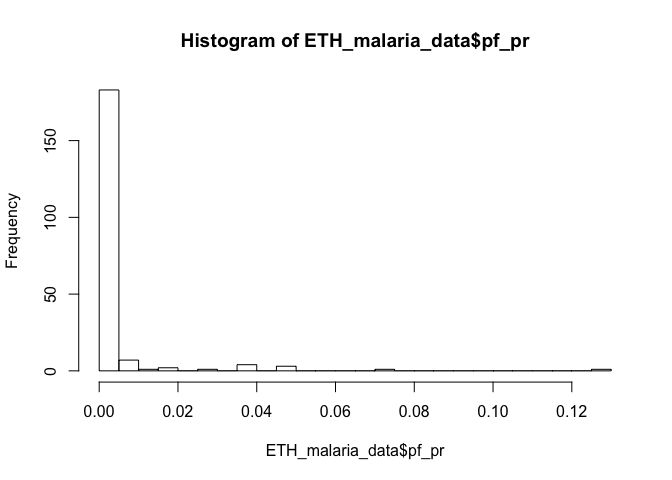
Plotting and mapping spatial data
It is possible to use R’s base graphics to plot points, treating them like any other data with x and y coordinates. For example, to get a plot of the points alone
plot(ETH_malaria_data$longitude, ETH_malaria_data$latitude,
     ylab = "Latitude", xlab="Longitude") #boring!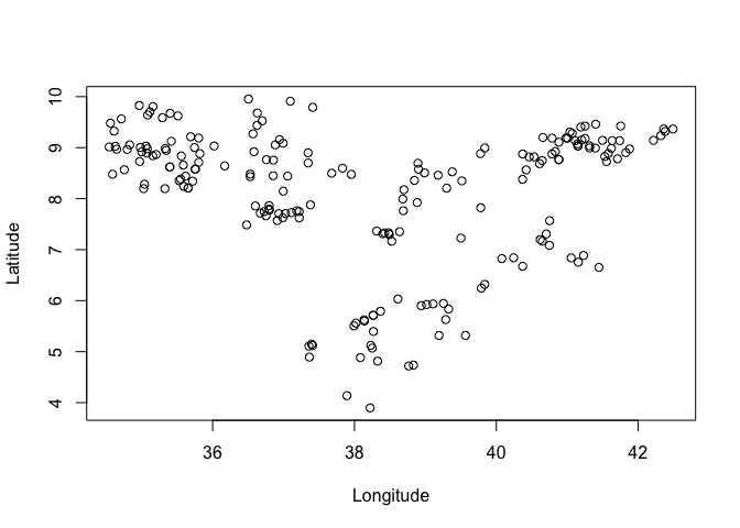
You might want to vary the size of the circle as a function of a variable. For example, if we wanted to plot points with size relative to prevalence we can use the expansion argument cex
# Use the cex function to plot circle size as a function of a variable
plot(ETH_malaria_data$longitude, ETH_malaria_data$latitude,
     cex = ETH_malaria_data$pf_pr * 10,
     ylab = "Latitude", xlab="Longitude")
Working with ‘Spatial’ objects
In R, it is sometimes useful to package spatial data up into a ‘Spatial’ class of object using the sp package. This often makes it easier to work with and is often a requirement for other functions. The sp package allows you to put your data into specific spatial objects, such as SpatialPoints or SpatialPolygons. In addition, if your data are more than just the geometry, i.e. if you have data associated with each spatial feature, you can create spatial DataFrames, i.e. SpatialPointsDataFrames and SpatialPolygonsDataFrames. For example, if we wanted to create a SpatalPointsDataFrame using the Ethiopia data:
ETH_malaria_data_SPDF <- SpatialPointsDataFrame(coords = ETH_malaria_data[,c("longitude", "latitude")],
                                      data = ETH_malaria_data[,c("examined", "pf_pos", "pf_pr")],
                                      proj4string = CRS("+init=epsg:4326")) # sets the projection to WGS 1984 using lat/long. Optional but good to specify

# Summary of object
ETH_malaria_data_SPDF
## class : SpatialPointsDataFrame
## features : 203
## extent : 34.5418, 42.4915, 3.8966, 9.9551 (xmin, xmax, ymin, ymax)
## crs : +init=epsg:4326 +proj=longlat +datum=WGS84 +no_defs +ellps=WGS84 +towgs84=0,0,0
## variables : 3
## names : examined, pf_pos, pf_pr
## min values : 37, 0, 0
## max values : 221, 14, 0.127272727
# SPDFs partition data elements, e.g. the coordinates are stored separately from the data
head(ETH_malaria_data_SPDF@coords)
## longitude latitude
## [1,] 38.9412 5.9014
## [2,] 39.8362 6.3175
## [3,] 40.7521 7.5674
## [4,] 38.7650 4.7192
## [5,] 37.3632 4.8930
## [6,] 39.7891 6.2461
head(ETH_malaria_data_SPDF@data)## examined pf_pos pf_pr
## 1 220 0 0.000000000
## 2 216 0 0.000000000
## 3 127 0 0.000000000
## 4 56 0 0.000000000
## 5 219 0 0.000000000
## 6 215 1 0.004651163
# You can quickly access the data frame as per a standard data frame, e.g.
head(ETH_malaria_data_SPDF$pf_pr)
## [1] 0.000000000 0.000000000 0.000000000 0.000000000 0.000000000 0.004651163
# You can use the plot or spplot function to get quick plots
plot(ETH_malaria_data_SPDF)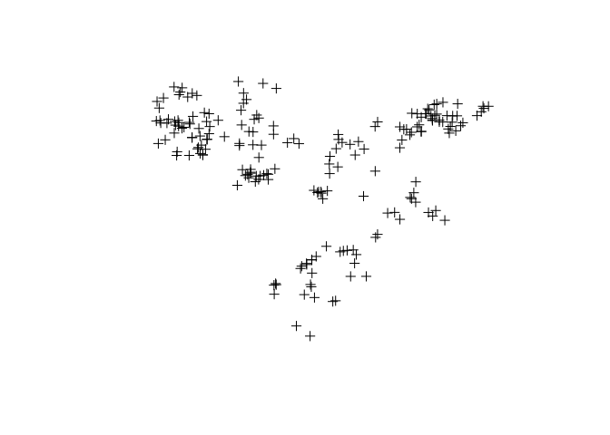
spplot(ETH_malaria_data_SPDF, zcol = "pf_pr")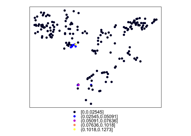
Let’s have a look at SpatialPolygonsDataFrames. To load a polygon shapefile (or other file types), you can use the readOGR function from the rgdal package. For example, if you wanted to load in the province boundaries for Ethiopia shapefile ETH_Adm_1 from the ETH_Adm_1_shapefile.zip folder on GitHub, assuming you have downloaded the folder of files you would use the following command
ETH_Adm_1 <- readOGR("ETH_Adm_1_shapefile", "ETH_Adm_1")As it happens, admin boundary data is accessible using the getData function from the raster package. Be careful as some other packages also have a getData function, so to specify that you want to use the getData function from the raster package you can use the following code
# You first need the ISO3 codes for the country of interest. You can access these using `ccodes()`. For Ethiopia, the ISO3 is ETH.

# The getData function then allows you to retrieve the relevant admin level boundaries from GADM.
ETH_Adm_1 <- raster::getData("GADM", country="ETH", level=1)
Now we can plot the point data in context
# Plot both country and data points
plot(ETH_Adm_1)
points(ETH_malaria_data$longitude, ETH_malaria_data$latitude,
     cex = ETH_malaria_data$pf_pr * 10,
     ylab = "Latitude", xlab="Longitude",
     col="red")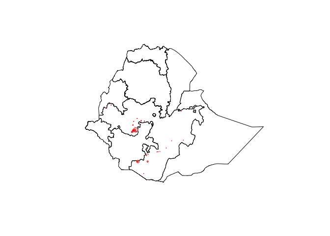
Plotting data using web maps
Rather than just relying on R base graphics, we can easily create webmaps using the leaflet package. There are many basemaps available. See here. For any map, identify the Provider name, e.g. “OpenStreetMap.Mapnik”, by clicking on the map.
# Define your basemap
basemap <- leaflet() %>% addTiles()
basemap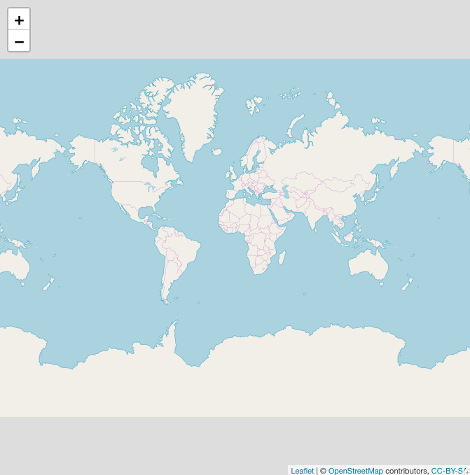
# Or choose another basemap
basemap <- leaflet() %>% addProviderTiles("Esri.WorldImagery")
basemap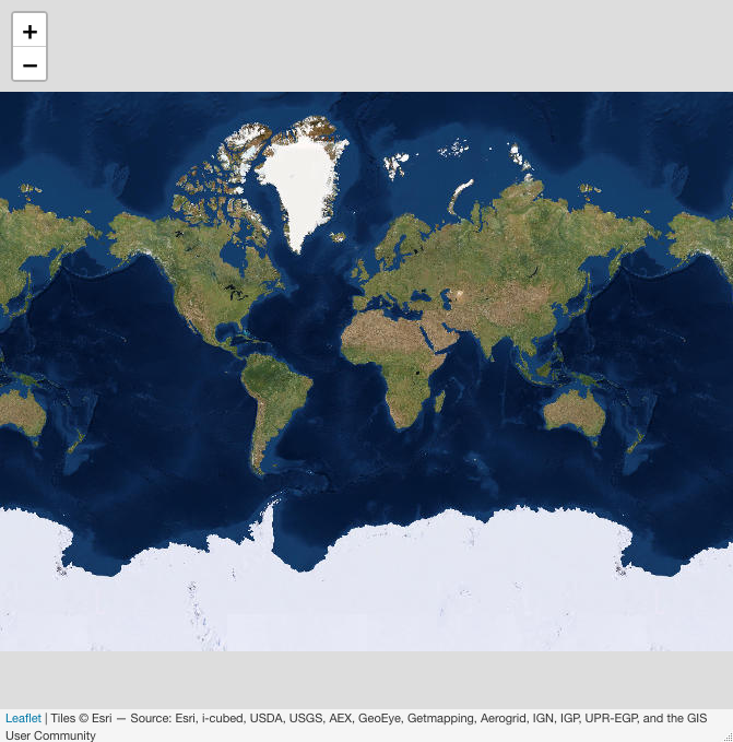
#Let's choose a simple one
basemap <- leaflet() %>% addProviderTiles("CartoDB.Positron")
You can use the ‘piping’ command %>% to add layers. As our point and polygon data are already ‘Spatial’ object this is easy
basemap %>% addPolygons(data=ETH_Adm_1)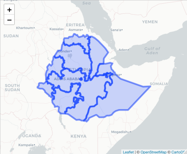
# to change the colors/line weight
basemap %>% addPolygons(data=ETH_Adm_1, color = "red",
                        weight = 1, fillOpacity = 0.2)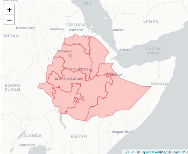
#You can also add popups
basemap %>% addPolygons(data=ETH_Adm_1,
                        popup = ETH_Adm_1$NAME_1)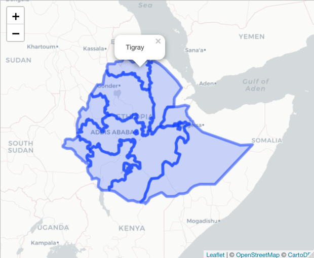
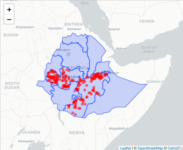
# If you want to add points as well
basemap %>% addPolygons(data=ETH_Adm_1, weight = 2,
                        popup = ETH_Adm_1$NAME_1) %>%

            addCircleMarkers(data=ETH_malaria_data_SPDF,
                             color="red", radius = 2)
The leaflet package also has some nice functions for generating color palettes that map to a variable you want to display. For example, if we wanted to create a color ramp relative to prevalence we could use the colorNumeric function. See ?colorNumeric for other ways to build color palettes such as colorBin
library(wesanderson) # for a nice color palette
colorPal <- colorNumeric(wes_palette("Zissou1")[1:5], ETH_malaria_data_SPDF$pf_pr, n = 5)

# colorPal is now a function you can apply to get the corresponding
# color for a value
colorPal(0.6)

basemap %>% addPolygons(data=ETH_Adm_1, weight = 2, fillOpacity=0,
                        popup = ETH_Adm_1$NAME_1) %>%

      addCircleMarkers(data=ETH_malaria_data_SPDF,
                       color = colorPal(ETH_malaria_data_SPDF$pf_pr),
                       radius = 2,
                       popup = as.character(ETH_malaria_data_SPDF$pf_pr))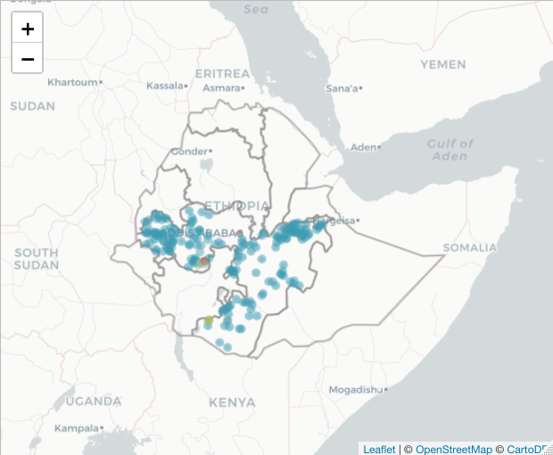
You might want to add a legend. This just goes on as another layer on the map. First define the labels. In this case, we are using quintiles.
basemap %>% addPolygons(data=ETH_Adm_1, weight = 2, fillOpacity=0,
                            popup = ETH_Adm_1$NAME_1) %>%

      addCircleMarkers(data=ETH_malaria_data_SPDF,
                       color = colorPal(ETH_malaria_data_SPDF$pf_pr),
                       radius = 2,
                       popup = as.character(ETH_malaria_data_SPDF$pf_pr)) %>%

      addLegend(pal = colorPal,
                title = "Prevalence",
                values = ETH_malaria_data_SPDF$pf_pr)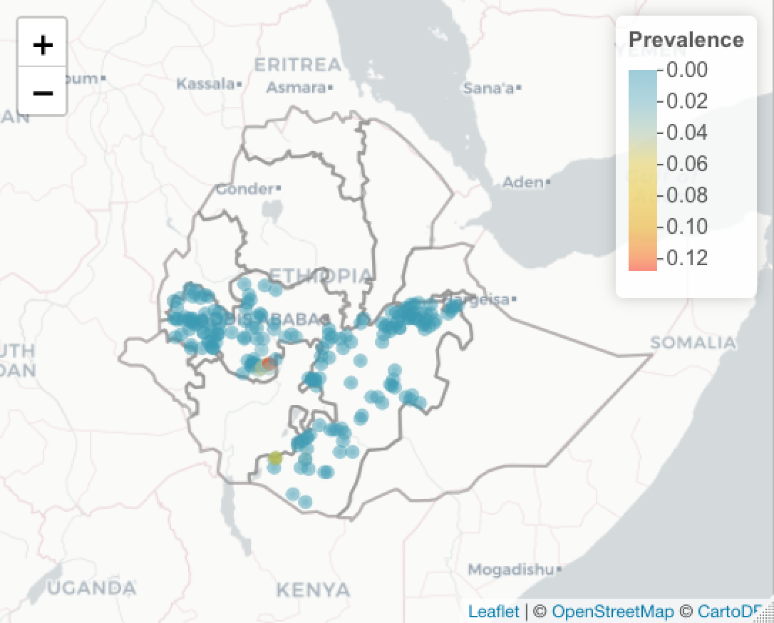
For more complex popups, you can define the HTML
basemap %>% addPolygons(data=ETH_Adm_1, weight = 2, fillOpacity=0,
                        popup = ETH_Adm_1$NAME_1) %>%

      addCircleMarkers(data=ETH_malaria_data_SPDF,
                   color = colorPal(ETH_malaria_data_SPDF$pf_pr),
                   radius = 2,
                   popup = paste("<p>","Prevalence:",
                                 round(ETH_malaria_data_SPDF$pf_pr,2),
                                 "<p>")) %>%

            addLegend(pal = colorPal,
                title = "Prevalence",
                values = ETH_malaria_data_SPDF$pf_pr)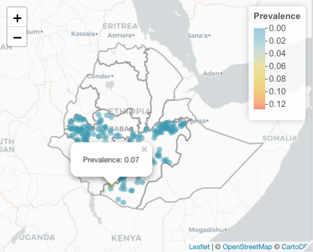
Plotting raster data
If you have a local raster file (e.g. a .tif file), or a URL to a valid .tif, you can use the raster command to load the file into R. For example, to load this raster of elevation in Ethiopia into memory you would use the following:
elev <- raster("https://github.com/HughSt/HughSt.github.io/raw/master/course_materials/week1/Lab_files/Data/elev_ETH.tif")The getData functon from the raster package allows you to get hold of some select raster data, such as elevation and bioclimatic layers. To get hold of elevation for Ethiopia, use the following
elev <- raster::getData("alt", country="ETH")
elev

    ## class       : RasterLayer
    ## dimensions  : 708, 972, 688176  (nrow, ncol, ncell)
    ## resolution  : 0.008333333, 0.008333333  (x, y)
    ## extent      : -5.6, 2.5, 9.3, 15.2  (xmin, xmax, ymin, ymax)
    ## coord. ref. : +proj=longlat +datum=WGS84 +ellps=WGS84 +towgs84=0,0,0
    ## data source : /Users/sturrockh/Documents/Work/MEI/DiSARM/GitRepos/spatial-epi-course/https://raw.githubusercontent.com/HughSt/HughSt.github.io/master/_posts/ETHA_msk_alt.grd
    ## names       : ETHA_msk_alt
    ## values      : 143, 704  (min, max)
You can plot using the standard plot function
plot(elev)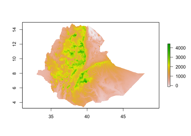
Alternatively, you can use leaflet
basemap %>% addRasterImage(elev)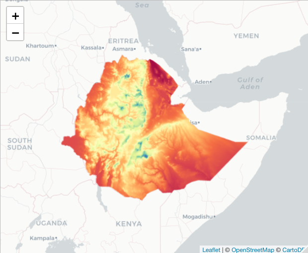
If you want to add a legend, you have to define the color palette first
# Define palette
raster_colorPal <- colorNumeric(topo.colors(64), values(elev), na.color = NA)

# Plot
basemap %>% addRasterImage(elev, color = raster_colorPal) %>%
addLegend(values = values(elev), pal = raster_colorPal)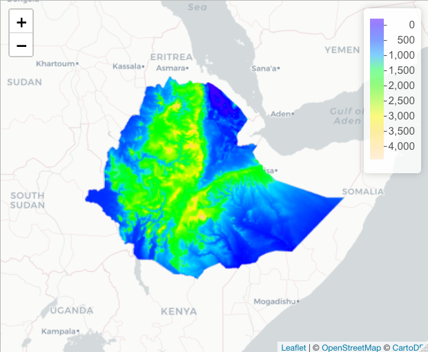
If you want to export the data, there are several options.
Export button in the Viewer pane. Using ‘Save as webpage’ creates an html file which you can open using a browser.
Save as kml for someone to open in Google Earth
library(plotKML)
plotKML(ETH_malaria_data_SPDF) # see ?plotKML for more options
Resources
The R packages sp and raster are both important packages for spatial analysis.
The sf package provides an alternative way of handling spatial data. This package can be particularly useful if you have large datasets.
R studio also have a fantastic site outlining the use of leaflet
Great general resource for using R for spatial analysis
Pretty comprehensive site outlining using R for GIS
Key readings
Ostfeld, R. S., G. E. Glass and F. Keesing (2005). “Spatial epidemiology: an emerging (or re-emerging) discipline.” Trends in ecology & evolution 20(6): 328-336.
Pfeiffer, D., T. P. Robinson, M. Stevenson, K. B. Stevens, D. J. Rogers and A. C. Clements (2008). Spatial analysis in epidemiology, Oxford University Press Oxford. Chapters 1-3